- Create a GANTT chart to organize time so that it's not wasted, if we can get at least 2-3 shots a day during filming, then ideally that will leave enough time for the animation of the faces and arms, as well as editing and special effects done in after effects.
- Don't rush, this is something which is going to be in the showreel so if there's at least half of it done to standard which is good enough to show to employers, then that's what can get marked.
- IDEALLY have filming done by December 19th, so that the remaining time both at home and in college can be spent putting the rest of it together.
Friday, 6 December 2013
Post for myself, McSqueeze Targets.
With a deadline of January 17th and filming ideally starting on December 9th, this will leave me with basically a month to film and edit the entire project. It's going to be one busy month, so i've set myself a few targets to hopefully keep me on the straight and narrow and finish in time.
Making up for absences.
Been away from this blog quite a while, I've been working on a project which I don't think has been mentioned here yet:
Lime and Plumishment.
It's a cartoon about a disgraced cop whose wife is killed by the mob, causing him to go spiralling into depression when he is forced out of his premature retirement by his chief in order to take down the crime outfit who destroyed his life. Also, he's an orange.

The cartoon's being produced with marionette puppets against a green screen background, where various scenes in this trailer for a fictional movie will be chromakeyed in.
The faces and arms will be hand-animated and placed ontop of the puppets in After effects.
The aim is to create something that plays it's self as seriously as possible, but in reality is just stupid to the point of being funny.
Currently the script is completed and the storyboards are being produced, with the idea being that filming the actual shots we need will begin on the 9th of December.
Thursday, 2 May 2013
SUPER BLOG POST: Evaluation of the college year
Overall I would say that the college year hasn't been too bad. There were several units that I was very enthused with and I felt like I was in my element, equally there's been a few units which I struggled with a bit more.
The main units which I was very much interested in mainly revolved around drawing. The 2D animation unit at the beginning was my first real foray into Traditional animation, which I found to be quite fun as well as a good way of combining animation I'd learned how to do using Flash and the more hand-drawn stuff I liked to produce. I found testing motion and adding in details later to actually be a much more efficient process than I thought it would be and not dissimilar to what I'd done previously on the computer. The main thing which I learned from that unit was about how to construct a walk cycle, as before, my walks looked less like walks and more like skipping which would be alright in circumstances which called for it but otherwise just looked silly.
I felt like I was also in my stride on the storyboarding module, as storyboarding is something that I had done before and had brought over previous skills from another animation I did to create fully coloured storyboards. I did enjoy trying to capture the action in a frame and I think I did well enough, with enough variation in each frame to make it interesting and the action not too much of the same thing.
Where it was different from what I normally do is when we took the storyboard assets and combine them in After Effects to make an animatic, I normally make animatics in Flash to sort out timing, however this was an interesting approach and it certainly looked closer to what I would hope a final product would look like. After Effects was surprisingly easy to use once I got the hang of it and was very compatible with Photoshop which made importing assets to be animated a really simple task, I also thought about the possibilities of using After Effects for actual animation.
The character design unit was a mixed bag, as there was a large component of creating a character, designing the back story and then illustrating a turnaround sheet. This part was what I'm usually used to, my character ended up actually going through more design changes than I normally would do for a character and I ended up finding the value in just sitting down and sketching and doodling and then not stopping until there are pages of ideas for each body part. The advantage of my character was that, being a robot, it made sense that parts of the character could be mish-mashed or interchangeable as is often the case with electronics. This allowed me the luxury of being able to swap around heads, hands and other body parts until I created a robot which I felt had enough personality. The second part of this unit was that the characters would then be taken and recreated in 3D using our model sheets as reference. We used Cinema4D, which is a program I've used before, although my understanding of how to model and animate characters was much less than it was before I started this unit. I learned how to model, rig and animate my robot. Modelling was actually easier than I imagined it would be, once I learned how to do it. Luckily for me, my robot was already designed to be very uniform and had many straight edges which allowed me to model in a much more boxy style, which I felt might be easier than modelling organic characters. The other advantage of my character's design was that his arms were basically tubed, which meant that when they were modelled and rigged, they were basically pipes which could be manipulated on the rig and had several bones places along side it to make the arm bend much in the way a hose does, the same goes for the legs, however from the knees down were large calves and feet, which were harder to rig and animate.
Rigging it's self was a nightmare, I thought, I rather struggled which it because when I eventually figured out how to set it up, there were difficulties getting everything to move the way it was supposed to. Particularly with the knee and shoulder joints, there was a lot of misshaping and warping with the former, and clipping with the latter. The main problem was trying to set up and foot roll which was controlled by a slider, I found that I actually couldn't achieve it because every time I connected the joints together in a hierarchy and told them to roll, the leg would shoot off in an insane direction. To remedy this I went with a much more simpler approach; I created several joints inside the foot and rooted them to controllers which could be manipulated and then I manually keyframed in the foot roll, it was a bit more primitive than the slider but I felt like it did the job in the long run.
The actual animation was pretty straightforward as I was able to block out the basic movements first and go back later and put in the fine details, this was very handy as the timeline preserved everything and I was able to test movements before I finalized them, the only problems with the animation process were caused by my rig and the way I'd set it up.
The practice enrichment module was a unit which I got a fair amount of simply because I found that I could draw human likenesses better than I thought I could. The life drawing was a new experience because I'd not actually done any proper life drawing before, the part where I think I succeeded was the gesture drawing as eventually I got used to the idea of quickly attempting to recreating poses and I hope that's helped me to be able to capture action better. Some of the drawings were better than others, I had a problem with proportions at first, which seemed to be rectified the more I practiced. I also found that the more I actually filled the paper with a larger image, the easier it was to maintain proportions and to add detail.
Life drawing is something that I would want to try again because I think it would definitely help, even if I am primarily a cartoonist, it helps to look at reality if I plan on distorting it.
The unit which I had trouble on was the Cut-out unit because while it was straightforward, it was a unit which I just wasn't entirely sure about because the style of animation wasn't really suited to me. Overall however, I think that I've learned a fair amount of new things in order to expand what I already know. The hope is that I'll improve more at drawing and illustration and that this will benefit my animation skills.
Monday, 29 April 2013
Personal reflection: Why does my work look less vibrant?
I can't help but feel that when I ink my rough animation it loses something in the process, I really like the vibrance and the real sense of movement that you get from the sketched animation (Not to mention that since there's no definite lines, the characters don't tend to wobble and become off model), this doesn't really occur with animation created using premade assets, however it does tend to affect hand-drawn animation a lot more.
Looking at it, I think learning how to ink individual frames is important, but I have a much easier time inking single drawings on photoshop than I do in, say, Flash. Switching over to Flash MX to make the final lines is much easier, as the brush tool in later Flash version is actually worse, surprisingly!

Above: Flash CS4. A curved line becomes squiggly when zoomed in, this is made even worse when using pressure sensitivity on a tablet!
Below: Flash MX. It at least looks a lot better, you give up pressure sensitivity but I still think this looks like a much more solid, defined line.
 I can't help but feel that's just going backwards. It's something I need to work on, although I do think using Flash MX has at least helped in a small way, but I still feel like my work loses something when I ink it in.
Looking at it, I think learning how to ink individual frames is important, but I have a much easier time inking single drawings on photoshop than I do in, say, Flash. Switching over to Flash MX to make the final lines is much easier, as the brush tool in later Flash version is actually worse, surprisingly!

Below: Flash MX. It at least looks a lot better, you give up pressure sensitivity but I still think this looks like a much more solid, defined line.

Industry: Animation UK (Not an alliance!)
Animation UK is a group whose aim is to provide tax breaks for Animation within the UK, the group was founded by Animator Oli Hyatt who works for Blue Zoo Animation in London. I've actually met them before because the lectured at Animex 2012, about their initiative to try and improve the climate in which animation studios can survive within the UK.
Animation doesn't really recieve tax breaks in the UK in the same way that movies do, Animation UK feels this puts UK animation studios at a disadvantage in the world market as it means that it will be more cost-effective to produce animation abroad, costing the UK animation industry jobs and money etc.
The aim is to create fairer trading conditions for those who produce animation within the UK and "to help protect or increase the ownership of IP that is of such value to the UK Economy."
Animation UK is attempting to work with the government to see if they can hopefully implement such tax breaks, having attended several parliament meetings to try and make a push, as well as contacting George Osbourne directly. They have recieved SOME support from members of Parliament, particularly those whose young children watch animation.
Animation UK is a pretty cool thing, if I'm honest, I would like to see the UK having more of a foothold in the industry because hopefully it will mean more jobs, and more opportunities for young creatives to be able to make more of a living in the arts.
Animation Alliance UK
I felt like it was worth making a post about the Animation Alliance UK, who are a group of professional animators, producers and various other professionals within the UK animation industry who band together:
- to act as a network and focus for sharing information and discussion
- to advocate for the support of independent animation in the UK
- to lobby for investment in production, training, archive
Jobs: Norwich Castle Commission
Norwich Castle Animation Commission
Having found a site called artjobs.co.uk, which is a website which seems to give listings for jobs within the arts, both paid and unpaid, as well as some festivals and competitions.
Having looked, there is this listing for a historical animation for Norwich Castle.
Part of the reason this listing appeals to me is that the brief specifies that they would not like a CGI look to it and would prefer something hand crafted like "Hand-drawn or cutout", the idea of making a historical animation in 2D animation is something I've dealt with before and actually found to be a pretty interesting process because of the amount of research of the period that one has to put into it, rather than the research of techniques.
While I don't think I can enter just yet, as the payrate is too high for someone with my lack of professional experience, it's simple ideas like this that could be where the animation world takes me. As well as big films and festivals, there is also a need for animation in smaller places such as in schools and museums and exhibits to teach and tell a historical story.
Industry: Quay Animation
Quay Animation is a studio created by Mark Jobe based in the North East. Work that quay has done includes Short films, motion graphics, animation, 3D modelling and even Video installations at art exhibits.
 The Motion graphics work they've done seems like there are opportunities for 2D work, and I would imagine that even on the 3D elements there are illustration and concept art used in the pre-production process.
A bit more my style, Quay has also created mascot designs for The Great North Air Ambulance as well as other projects. This seems to be character design and illustration, which are an area of expertise I would want to engage in.
In terms of social media, Quay maintains a blog to talk about what's happening with their projects and films in addition to a twitter account which has notifications about competitions, the local animation industry in the north east and also can put you in contact with the founder, Mark Jobe.
Quay does seem very polished and their work isn't just standard adverts, as they also have more artistic things in their portfolio as well as illustration. Therefore it seems those who work there must be very versatile.
Thursday, 25 April 2013
Sega's Design a Mascot contest
Being a Sega fan, I felt like it was worth posting about this contest which they are putting on. The task is to design a character who encompasses Sega, and the winning character will become a mascot for the NicoNico Douga live Show which they are putting on. (Think Japanese Youtube, where the company can host live steams) In addition, any games or merchandise made of your character will be sent to you and you will receive Toshihiro Nagoshi's signature, Sega's Creative director who will be judging the entries live on the show.

Rules:
Closing Date: June 9th, 2013
Picture format, Any res GIF, JPG, PNG (File can't be larger than 10MB)
You also have to tag your entry with a specific contest title which is in Japanese.
While it's not stated whether or not contestants have to be Japan-only, the contest has been reported on several of the Sega news sites, with artists and illustrators wanting to take part. For many the ultimate prize is having created a character who becomes part of Sega history and could conceivably appear on games and merchandise. Not only might this be an amazing piece of publicity for the designer, but also would be something to add to the CV.
Tuesday, 23 April 2013
Industry: Studio Moo
In keeping with the theme of animation studios in the North, Studio Moo is another animation studio based in Gateshead.
Compared with Arcus Studios, Moo appear to have more of an emphasis on CGI and 3D animation, however they also appear to on occasion do 2D animation for clients. Notably they have also done Visual effects for Live-action footage and Stop Motion animation, particularly for the advertising campaign for the game Rapidough, which is like Pictionary but with plastercine.

In terms of social media, Moo operate a facebook page and a Twitter account and have retweeted job classified for other studios around the Newcastle and Gateshead area, although they themselves do accept portfolios.
I once tried to contact them to see what it would take to get hired and was asked to present my portfolio, however I didn't hear back so I can assume that it wasn't good enough.
They are a studio I COULD try to see if I could get experience or work with after Uni, although I'm not sure whether I've got a skillset they want.
Compared with Arcus Studios, Moo appear to have more of an emphasis on CGI and 3D animation, however they also appear to on occasion do 2D animation for clients. Notably they have also done Visual effects for Live-action footage and Stop Motion animation, particularly for the advertising campaign for the game Rapidough, which is like Pictionary but with plastercine.
In terms of social media, Moo operate a facebook page and a Twitter account and have retweeted job classified for other studios around the Newcastle and Gateshead area, although they themselves do accept portfolios.
I once tried to contact them to see what it would take to get hired and was asked to present my portfolio, however I didn't hear back so I can assume that it wasn't good enough.
They are a studio I COULD try to see if I could get experience or work with after Uni, although I'm not sure whether I've got a skillset they want.
Animation practice: Sloth into Digger Morph
The animation is quite simple and rough but I was mainly looking to create a smooth transition between the sloth and the digger. I THINK I've achieved this, although if I were to finish it off for my showreel, I would need to refine it a little more, but the motion is fluid and it has the necessary odd-factor.
Industry: Arcus Studio
Arcus Studios are an animation studio based in Gateshead and seemingly specialize in 2D animation however there is also a lot of 3D animation work they have done as well.

Their portfolio ranges from things such as stings and idents to Public art installations.
Having done work for the BBC, E4 and more, Arcus Studio appears to be a general animation company working on several different kinds of projects.
Lots of the 2D work appears to be produced with Flash which is an area I am familiar with, and in terms of social media, the studio operates a Twitter account.
Looking at the website, it would appear that they themselves (Or at least the person running the Twitter) have used it to find animators who they would like to hire, even if just for temporary basises.
Upon inspection, it seems like something I could try for if I wanted to continue in 2D animation as it appears to play a large part in what they do.
Monday, 25 March 2013
Things I like: E4 Stings

E4, a TV channel run a competition to find Stings to run on air. Having had a look at some of the finalists from 2011, it's my hope that I'd be able to create something that's good, or up to a decent standard.

By Andrew Baxter
Probably my favourite, done in a 2D style and obviously inspired by Anime and Fighting games. The way that the logo is brought in is clever, because it has an excuse to be in there rather than just appearing. The actual quality of the animation is really good, as it's authentic to the frame-stealing which was common (And still is, for not for budgetary constraints) in Anime, particularly from the 40s well into the late 90s.
The attention to detail is in fact so great that film grain has been added to make the clip look campy and vintage. The character designs are stereotypical and are clearly influenced by something like Street Fighter, as the protagonist of the piece bares a striking resemblance to Ryu, the villain wears his oddly coloured hair up in the most amazing flat-top which is reminiscent of Guile from the same series of games, further cementing it's roots in fighting game culture.
The palette used is very bright and colourful, and the effects are very flashy as there it's lots of light and special attacks which is common of the genre, having a bright palette also helps to make it visually interesting as compared to lots of other E Stings, it is eye-popping but keeps the adherence to purple which seems to be a theme with E4.
By Tim McCourt


A different pace from the other one, this one is themed after an advert for hair products. Another clever way to introduce the logo, as "E4" is the name of the product, so the logo is seen on bottles and boxes, so it's presented in a way which is less conventional than just showing the logo.
The animation it's self is very good, smooth and well drawn, very stylized to be funky and evoke a smooth nature. This is complimented by the colour palette which is not as bright as the previous one and follows more of a pattern, with the colours being darker and subtle to try and reinforce the notion that E4 man is a cool guy, in addition to wearing different clothes to fit the different backgrounds, finally ending on the sort of gradient background which is common of hair product adverts, this is where E4's trademark purple tone is introduced. The detail is quite nice as the movement is smooth and the characters are expressive, with the women emoting more because they're supposed to be in awe of E4 man, and E4 man himself being nonchalant and cool.
I like how stylized this one is, it's an interesting sting not just because it looks good but also because it thinks outside the box, and the retro charm adds a lot of personality to it.
By Benjamin Howell

I'm.... not entirely sure I can explain this one.... And I think that's the point. It's one of those things which is so nonsensical and crackers that you just have to laugh, or be scared, or react in any way. The point of it is that it has no point. The fact it's so off the wall will help to confuse every viewer who sees it, and this will make it memorable because it's so different.
The colour palette is bright, the drawings are simple. It gives me the impression that it looks not dissimilar to the american cartoon shows that E4 plays, it's meant to look edgy and simplified, with a bright palette. E4's logo is this time used as a shield, which is good presentation because the logo is not just shown to you. It seems to me that all the finalists use more than 2 colours, and all present their radical idea with the logo being part of the scenery or the plot, rather than it just appearing.
I don't entirely know what's happening here..... I need a lie down.
By Onionterror


The first 3D one on this list. This one is the one with the least diverse colour palette, but that's not a bad thing because the variations on purple within the scene are a good thing, it doesn't need all the flashy colours because it helps to create a quirky and somewhat uniform environment for this robotic character.
The actual animation of the robot is great, it only races forward but it's quirky enough because it's all the robot needs to do to get the point across, the face it's self is expressive despite the fact it's just some dials and some teeth, but the use of teeth is enough to show the robot getting a but from the insane fuel. The way the camera is set up to take the impact of the robot adds a level of audience participation as the robot is going to crash into the viewer's television, and the fact that the it turns to static in the last second offers a good segway into whatever is on next.
The logo being presented as a fuel is a good way to work it into the plot and literally interacting with the character, it provides a quick route to the end of the advert as something quick and simple which does the job. The quick cuts also help to reinforce this idea of speed, and mean quick action leading to the apex of the action, where the robot crashed into the viewer.A Different Kinda War
By Olyolyoly


The only stop motion sting on this list, but nonetheless very interesting.
The soldiers are brightly coloured in contrast to the rather plain background, which helps them stand out, the logo is presented just as is unlike the rest, but the background of all the figures used is pretty neat.The use of toy soldiers is quirky, I don't really think it needs a plot, it's just there to entertain and provide something pretty to look at. The use of stop-motion and all the soldiers is a clever idea and probably not one you'd expect in an age where the average person has the tools to create 2D and 3D animation which can be professional level.
Thursday, 14 March 2013
Artists I like! Tyson Heese
Tyson Heese (Often known on the internet as Rittz) is an artist who I've admired for quite a long time, I first discovered him through his webcomic Boxer Hockey. Currently Tyson is working on covers for a comic series based on Bravest Warriors, a cartoon series by Pendleton Ward, creator of Adventure Time.
The reason that I like his work so much is partly because of how well-done it is, but also because it seems to combine a pretty good comic book style with human proportions and some adherence to realism, but with cartoony elements to make something that can be serious when it needs to, but it can get as over exaggerated and silly as cartoons but without it getting in the way of the plot.
 Actual presentation of his comics is something I really enjoy because his comic boxer hockey is cinematic during the actual matches (Of a sport names Boxer Hockey) and it's able to encorporate humor and more serious elements. Heese's work is always theme-appropriate and he also knows how to tell a pretty well-thought out story, as well as often providing little mini comics and other goodies to his fanbase.
Heese often lays out and draws on paper and then inks, colours and shades his comics and pictures in Photoshop, but he can animate almost entirely in flash and produce the same level of quality in his drawings, also with fluid motion and as much characterization as can be found in his illustration work.


The reason that I like his work so much is partly because of how well-done it is, but also because it seems to combine a pretty good comic book style with human proportions and some adherence to realism, but with cartoony elements to make something that can be serious when it needs to, but it can get as over exaggerated and silly as cartoons but without it getting in the way of the plot.

Heese often lays out and draws on paper and then inks, colours and shades his comics and pictures in Photoshop, but he can animate almost entirely in flash and produce the same level of quality in his drawings, also with fluid motion and as much characterization as can be found in his illustration work.
You can watch the short film "Switch" on Youtube:


Monday, 11 March 2013
Artists I like! Adrian Johnson

Adrian Johnson is an illustrator and Animator from Liverpool who I really like because of the very geometric style his work has. It's always very colourful and clean and often, while looking as clean as something produced digitally, has a very traditional look to it. One of the reasons that I like his work so much is that it seems to harken back to animation styles from the 60s and 70s, the characters look like paper cutouts who have been made from tissue and textured fabric. I'm also fond of the cartoony aspects of the work, but the fact that it seems to also encompass more art deco elements in some cases and presents things in a somewhat simplistic style really appeals to me.


Johnson is also an animator and has taken his simplistic style and has translated it into movement in a very compelling way, many of the handmade looking quirks from his illustration work have been brought over to give the same fun look whose main charm is that the work doesn't need to be complicated and is able to create fun characters and a colourful atmosphere.
Adrian's work can be found at: http://www.adrianjohnson.org.uk
and also at http://www.bigactive.com
You can also find an interview with him at: http://vimeo.com/41941597
Artists I like! Nigel Dobbyn
Nigel Dobbyn's an illustrator whose worked in the illustration and comic industry for a number of years. Working on thing such as 2000AD, Sonic The Comic and various other works for Egmont, Panini and more.


 Dobbyn's drawing style is distinctive despite often working with Licensed characters and therefore having to stick to certain guidelines. Some work which I think best shows some of his prowess is the Knuckles strips he did for Egmont Fleetway's Sonic the comic, as well as his work on 2000AD because his work with more traditional media has a very good attention to detail not just in the characters but also in the backgrounds as he has often exploited interesting brush techniques such as very watery brushes to let the color diffuse together to create very dirty, rusted robots. Or flicking white paint onto a background to create stars for a space scene.
Although Dobbyn is very skilled at traditional work, he has also become accustomed to more digital methods for creating comics and illustrations now.
While his pencilling is still done on paper with pencil, he has taken to using Adobe Illustrator to ink his drawings and give them a very clean and crisp look thanks to the vectors of Illustrator. He masks of many mistakes and then imports into photoshop for colouring where he actually more often than not uses Gradients to create shade and tone. At the demonstration he gave at the Canny Comic Con, I was quite surprised that it's a process which seems very technical compared with his earlier work in comics that I had read previously.
The result is a very clean looking illustration, however it doesn't look machined as Dobbyn's drawing style is still there and his work in illustrator is so well detailed that it gives the impression it was inked more organically. His uses of custom brushes also help to create something which looks more like photoshop inking but at a much higher resolution, which is obviously better for being able to rescale prints.


All the work in this entry was created by Nigel Dobbyn and can be found at http://handtoeye.deviantart.com.
This is intended for educational use as it's a college blog, so I hope that Nigel doesn't take any offense to it, I'm not intending to rip anyone off.
Art academy! Batch 1
I quite like art academy, it's very good for painting despite the fact the DS has a screen resolution that's pretty tiny, but it's very intuitive and it actually behaves more like real paint and brushes than Photoshop does, also being able to just paint on the go on a small screen means I can sit on the couch and just doodle or make something.


This one was just messing about, didn't really have an idea of what would come out of it so I just kept adding details until something that I likes emerged from it.

This one was a request, obviously a bit more structured. My favourite part is probably the clouds and some of the lighting on the grass, overall I do like that both of the landscapes don't really have a lot of structure to them so I've just came out with something that doesn't quite adhere to the laws of physics, and that's pretty cool.
Wednesday, 20 February 2013
Rigging!
Been rigging my fully built character, the rigging process is deceptive because on the surface actually getting the skeleton in place was the easy part thanks to the joint tool. Once I got a hand of hierarchies it became easier to organize the joints and have them fit together into a working skeleton using an IK Rig.

 Connecting the limbs together used a hierarchy to make sure all movement was from the pelvis, and that the movement of the arm was from the chest etc. Much in the way the actual human body works.
Placing things within different joints was a challenge at first particularly with the shoulder pads as often they would move with the arm which would cause problems, or they would stay by themselves and the arm would clip through, these are some problems I have to correct.
Actually creating controls for the joints was done by making objects whose movement also affects the joints, using constraint tags to link the controllers and the joints so that I could use the controllers to move some of the joints, but the controllers can be in a separate folder outside of the hierarchy.
This made it easier to co-ordinate my controls because they could be organized away from the joints. These objects which don't appear in rendering can then be manipulated to manipulate corresponding joints and were mainly used for the feet, head, and some on the chest and pelvis.
The hands and knees were however moved on a separate system of "Goals", these points could be moved around to move the whole arm or leg with them. The way these were achieved was using the IK chain I made, with points at the wrists (in the case of the arms) being considered the end of the chain so this point was set to move the entire arm. From there, we set a pole which is basically an elbow as it means the arm can only bend so far, in one direction so that the character's arm can't just suddenly turn the other way like his arm has been broken.


The legs move in a very similar manner, the goal is actually a little below the knee on the model and lifts the leg up, and when move forward will cause the leg to kick out with separate controllers moving the foot. The Pole is placed at the highest the leg can reach and about as far as the knee so that it will stay where it's supposed to and be able to portray walking.
Tuesday, 19 February 2013
Animex Game: Day 1
I went to the firs set of lectures for animex focusing on games. While I haven't thought of the games industry as much as film and TV, I thought that it would be handy as character animation could be similar in some ways even if there are some differences and limitations.
There were a fair few interesting speaker who focused on narrative, including Rhianna Pratchett, head writer of the new Tomb Raider reboot, who talked a lot about how story and script informs the gameplay experience and vice versa. While this isn't entirely related to animation in the film sense, I suppose technical limitations can still inform the plot, although not to the same extent as in games, where the experience is entirely mediated by the console. Very good talk, entertaining and offered a view on the work which goes into creating a plot for a game, in recent years sometimes rivalling film and literature due to the use of professional writers.

There were a fair few interesting speaker who focused on narrative, including Rhianna Pratchett, head writer of the new Tomb Raider reboot, who talked a lot about how story and script informs the gameplay experience and vice versa. While this isn't entirely related to animation in the film sense, I suppose technical limitations can still inform the plot, although not to the same extent as in games, where the experience is entirely mediated by the console. Very good talk, entertaining and offered a view on the work which goes into creating a plot for a game, in recent years sometimes rivalling film and literature due to the use of professional writers.

Another speaker was Eric Baldwin, from Naughty Dog Studios, famous for the Uncharted series. His talk was behind general development of Uncharted 3, giving the audience an insight intothe jump from Pre-production to Production. The talk showed several iterations of the teaser trailer which was axtually created while the game had next to no assets, the development teams actually use the teaser trailer to take some time and create assets for the game which basically kills 2 birds with one stone as it allows you to flesh out your game while making things which can actually be used. Some of the same stuff like animatics and other elements are similar to the production process of animation, so there were a few pointers to take away about how it works and what to expect. And also how to create useful things when you have very little to work with. Interesting and the speaker was good at relaying information (Once the technology sorted it's self out).
Final talk I found the most helpful was a lecture on the use of music in games, hosted by Austin Wintory, whose worked on several games, films and most famously having done the entire score for the PS3 game 'Journey'. He spoke very much about the emotional quality of music and how it lends it's self to the storytelling in ways which often you can't get across with words. The music can change the feel of a scene entirely, whether it be a film or a game. Journey's main emphasis was the grammy-nominated soundtrack, which actually progresses in time with the player, the instruments actually won't kick in until the player reaches a certain part of the level and things such as that to make sure the music is in time with the player's progression to try and keep the experience fresh and personal.
This sort of thing can be applied to my own animation, although I'm not a composer I can appreciate the importance of how music creates an experience for the audience.
Monday, 11 February 2013
HyperNurbs
Just for clarification, I've been using HyperNurbs to smooth off my character. This is why he has the rather rounded shape compared to the 2D drawing. (LEFT: No HyperNurbs, RIGHT: HyperNurbs!)


They're rather handy because they allow me to model things with minimal detail and then add it in later, so I just need to adjust the model to my liking after the HyperNurbs have been applied so I can focus on building a general shape with the character before I create the little bits later.
He lives!
Added the head, was originally going to have a toilet brush for the character but doing the bristles proved to be too difficult as I was modelling individual clumps of brush and it came out looking too much like a set of spikes, I decided doing a loo roll would be much easier and add a little bit more humor. The hand was made using block modelling and came out looking alright, used a HyperNerbs to smooth it. Arms are just cylinders but everything is using toon shaders to make it look more like the 2D image.


He still needs rigging and he still needs a hat, although the hat is technically optional, I feel like it really adds to the character. It looks alright to me, although I think the 2D to 3D translation went well, the character looks a bit too rounded compared with the model sheet, but it came out looking at least recognizable and you can tell they were the same character.

Monday, 4 February 2013
Artistic Analytical Antics
I can't say that all of the lecture i had to watch were for me.
The one which held my interest was Peter De Sève.
His illustration style was interesting and especially the New Yorker covers because they seemed to take real life and exaggerate it just enough to make it realistic so that people will empathize but enough of a humorous or cartoony element to make it more entertaining to the viewer.
The Ice Age stuff was surprisingly good, as while I've never really been a fan of the films, seeing the process behind the character design and the translation of De Sève's drawing style into 3D was interesting, the idea that he took one face and played around with the
proportions to create the final face.
The thing which I liked the most was the illustration style, and the painted covers on the New Yorker as it's
cartoony yet sophisticated enough
that it holds my interest, the colours used in the New Yorker covers help to create the warm atmosphere
or the cold atmosphere and either way
are very scene appropriate.
Mark Craste from Studio AKA was entertaining enough, his lecture shows the power of advertising as a
way of obtaining work but it's not a terribly interesting path to me, the Varmint segment wasn't clear enough
to follow, and the colours were incredibly dark. I get that it's his attempt to create vulnerable characters in a big
scary world but sacrificing narrative clarity and actually being able to see what's going on in certain scenes for
the sake of tone just seems a bit stupid, the actual visual quality of the animation was alright, again the process
of seeing a 2D character become three-dimensional was interesting but that's about all I got out of it if anything.
AJ Fosik creates sculptures out of a variety of materials, while I like the fact he's thinking outside of the box and
creating something extraordinary, I personally don't see the emotional aspects of his work, not to say there's NO
emotional aspects to his work, he himself said that his ideas which go into creating sculptures are very personal and
apparently become universal, meaning others must see the ideas he's trying to convey, even if I don't.
Visually interesting, yes. Highly emotional, not to me personally.
Some more work on the character

Shoulder pads were actually the same shape as the torso but smaller. Just as symmetrical though, so it keeps everything quite uniform

The face is just a texture so it can be animated, it's actually a plane which is separate from the head because I was having trouble with it on the actual head because it was mirrored on every side of the head.
The intention would be that the character's face would be 2D animation on a texture so that way I can keep some of the spirit of the two-dimensional drawing.
The accents on the torso and pelvis were achieved through putting the darker textures under the shaders so that they would look seamless. The addition of an emblem helped to disguise it.
The emblem also helps introduce a bit of 2D work to keep the spirit of the character.

Friday, 18 January 2013
Targets!
Targets, apparently. Yay, artistic progression and all that.
- Finish those character illustrations for the model sheet, and make the model sheet look very fancy with a theme which looks like a set of blue prints.
- Learn some modelling in Cinema4D since I'm going to have to use it to animate and create a 3D version of my character
- Analyze hats, the character needs one. Also because hats are cool, and it needs to look like a hat.
DONE.
Working the Scumscene
Recently did a logo for a really good website, UK Scumscene is a site which deals in metal and rock music within the UK and aims to give information, reviews and generally support the scene.
I was asked to make a new logo for the site with some custom typography rather than faffing about with fonts, which I thought was a really good idea because I really wanted to hand draw the font, which I ended up doing!
The first attempt came out not so well, I used a few references but I wasn't too skilled at making spiky metal font which is what thew site required.
 I wanted to include the Union Jack because I thought UK and all that, it would probably help to add a motif, also the use of only like 3 colours really appealed to me, the font it's self wasn't so great because when I shoved it through Illustrator it came out looking less metal and more cartoony, so I decided to scrap it and make something better.
In the meantime, I also thought of a new idea for the background. Keeping the 3 colour theme, I decided to create a two-tone union jack in red and black which would have white lettering to make it pop out against the dark background.
I used the old font which I'd vectorized as a placeholder because I hadn't created the new one yet, suffice to say it really made me glad I went for something different because I wasn't happy with it.
It was a nice idea, not what we went with but it was a step towards the final design.


I was asked to make a new logo for the site with some custom typography rather than faffing about with fonts, which I thought was a really good idea because I really wanted to hand draw the font, which I ended up doing!
The first attempt came out not so well, I used a few references but I wasn't too skilled at making spiky metal font which is what thew site required.

In the meantime, I also thought of a new idea for the background. Keeping the 3 colour theme, I decided to create a two-tone union jack in red and black which would have white lettering to make it pop out against the dark background.
I used the old font which I'd vectorized as a placeholder because I hadn't created the new one yet, suffice to say it really made me glad I went for something different because I wasn't happy with it.
It was a nice idea, not what we went with but it was a step towards the final design.

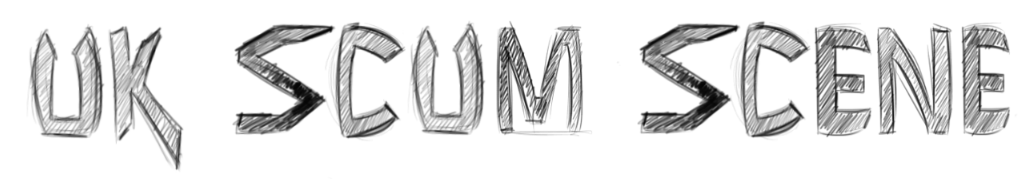

I then finally came up with a font which I thought would look more appropriate for the image of the site, I was given the instructions to grunge the font up to make it really distressed which thankfully I was able to do in Illustrator which means that if it's scaled up it'll keep the grunge. Lewis, who runs the site came up with the idea that the stripes should still be used and decided that if they too were grunged that it would help to compliment the type. The black lettering and red stripes against a black background was reversed essentially, with the red still in the same place and it came out looking much better thanks to it.

UK Scumscene is owned and ran by Lewis Clark and aims to keep the UK scene for Rock and Metal music thriving.
Cheers to Lewis for asking me to do the logo, it really is a good site and should totally be checked out if you're into Metal or Rock. Looking forward to seeing more from the site, as it's starting to gain a well-deserved reputation! You can pop over to them at This link, right here.
Subscribe to:
Posts (Atom)